Diamond Chart Pattern: Trading Reversal Graphic Formations

5 minutes for reading
Today, we will get acquainted with a tech analysis pattern called Diamond. Compared to other tech analysis patterns, the Diamond pattern appears rather rarely on the chart. This is the number one reason for its being unpopular among most traders. On small timeframes, the Diamond takes little time to form and might work off the signal by a couple of candlesticks. On larger timeframes, from D1 and higher, the pattern may take months to complete, which does not enhance its attractiveness for traders.
Not every trader can afford to wait two-three months for the signal to form. However, the Diamond has its advantages: it works off the signal almost always and may bring a substantial profit.
Conditions for and principles of the Diamond chart formation
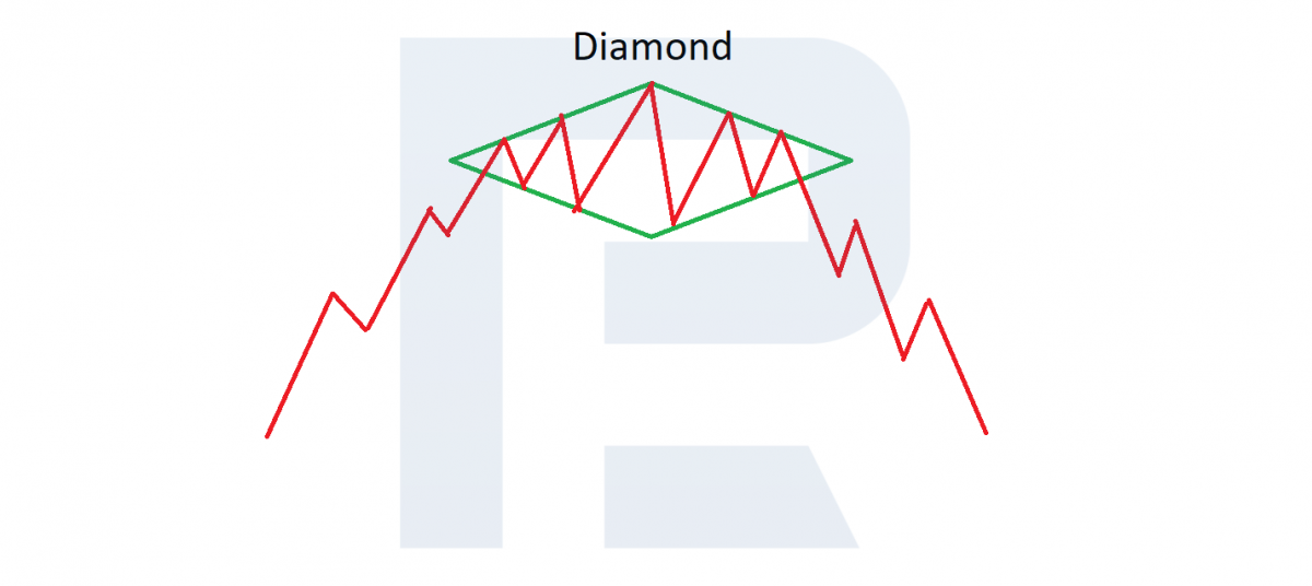
The Diamond is a reversal pattern which forms at the top of an uptrend or the bottom of a downtrend. It is easy to guess that it looks like a diamond.
Diamond pattern forming at the top of a trend
Forming at the top of the trend happens as follows. First, the price forms an expanding triangle: it may be isosceles or of a bit irregular shape. After the price reaches the highs, it starts fading, and on the chart, the amplitude of price fluctuations decreases. This is a decrease in the volatility in some sense, when most market players, especially major ones, have taken their positions and start waiting for other players to act.
Then the second wave of players enters the scene: they have noticed the pattern and are eager to make money on the signal. The thing is that the work-off of the Diamond pattern is based on the greed of market latecomers; however, they cannot compete with the first wave of players and just buy at the place where the players of the first wave start selling (closing the positions that have already yielded some profit).
As a result, the quotations start declining quickly, generating certain panic in the market so that the second wave of buyers also hurry to close their positions. Thus, Diamond shape forms at the top of the uptrend.
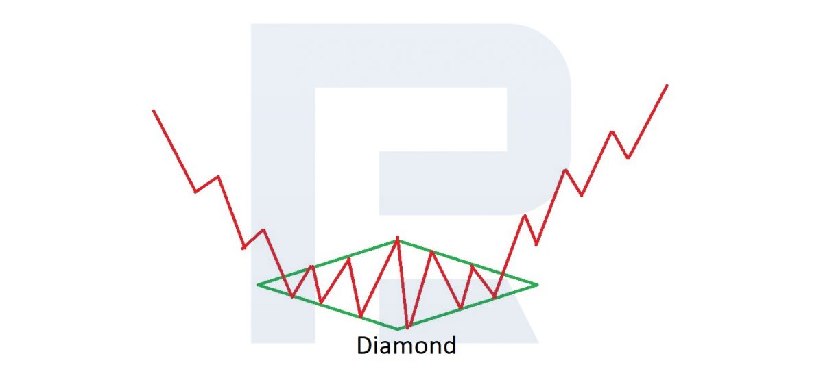
Diamond chart pattern forming at the bottom of a trend
A similar situation may be seen at the lows of a downtrend, only market participants swap places. For a time, the market is dominated by bears provoking a downtrend. At a certain point, the price begins a sideways movement, expanding the amplitude (creating an expanding triangle), then volatility shrinks, and a second – converging – triangle forms on the chart.
Then market players see the Diamond, and their greed overwhelms them. They start selling actively, but on the whole, the sellers are fewer than those who take the profit from the first wave (the profit is taken by a reverse buying order). As a result, the quotations start growing.
Then the greed of the second wave of traders plays an evil joke to them, and the closing of their losing positions leads to steep price growth. The first wave of sellers closes their positions with a profit and the second one – with losses. All in all, no matter how often or seldom the Diamond chart pattern forms, there will always be those who were late for the first wave, and their greed and lack of experience lead to the work-off of the pattern.
In some cases, when the critical mass of the second wave exceeds the first wave, the Diamond pattern may become a trade continuation pattern. However, this situation is not a work-off of the pattern and better be skipped.
Opening a selling position by the Diamond chart pattern
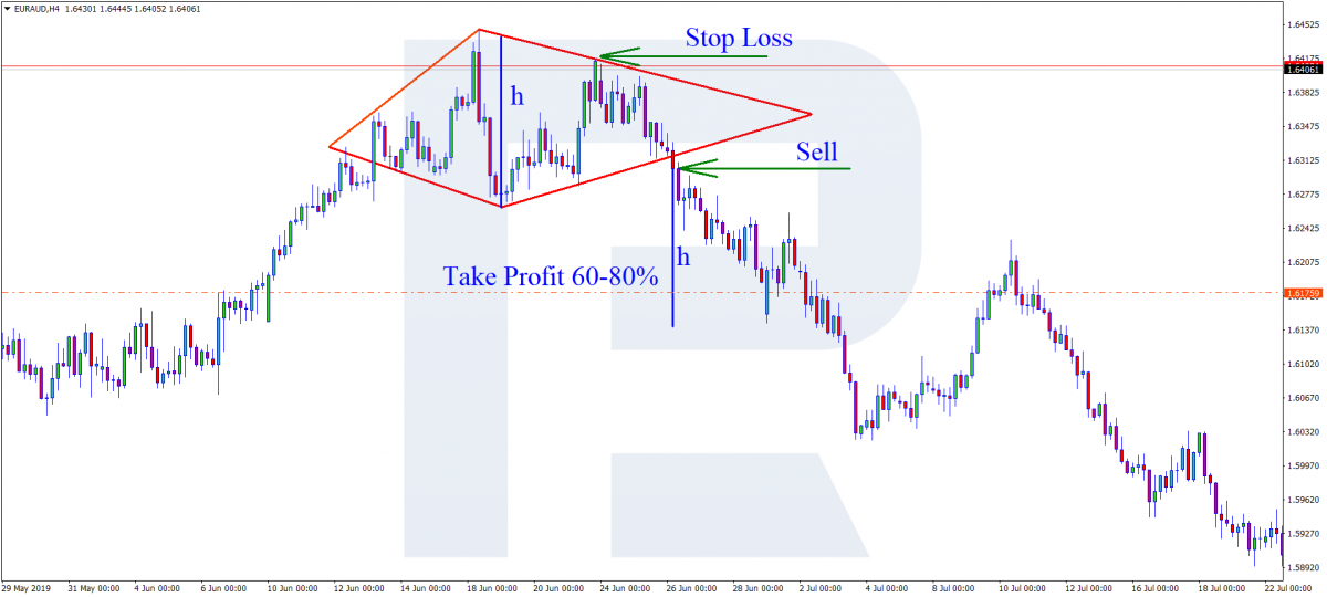
After the pattern completes on the chart with lines, it must look like a diamond. The price breaks out the lower right support line; the candlestick must close under this line.
Open a selling trade with your preferred volume. Place a Stop Loss behind the nearest high: normally, this is the upper right resistance line, near which the price closed. The potential profit is calculated as 60-80% of Diamond’s height (vertical dimension).
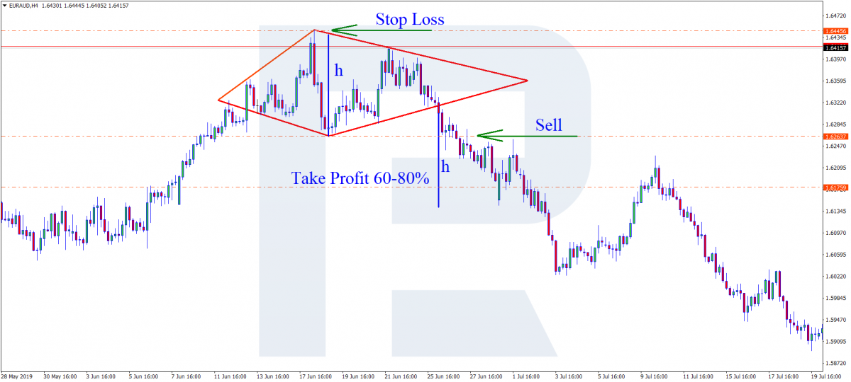
Alternatively, you may enter the trade at a breakaway of Diamond’s low. This is a more conservative way of opening a position, which, in some cases, may protect the trader from a false breakaway of the pattern. The potential profit is calculated the same way – as 60-80% of Diamond’s height. An SL may be placed either as described above or behind the Diamond’s high.
Opening a buying trade by the Diamond chart patterns
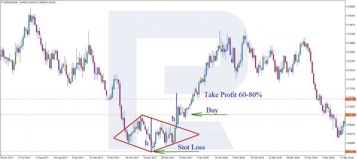
The price breaks away the upper right resistance line, and the candlestick closes above this line. Open a buying order with your preferred volume. Place an SL behind the nearest low, which is normally the lower right support line near which the candlestick closed. The potential profit is also calculated as 60-80% of the Diamond chart pattern size.
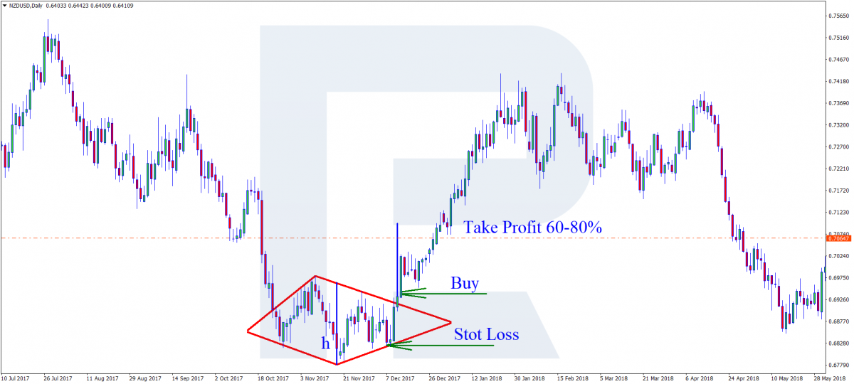
Alternatively, you may enter the trade at a breakaway of the Diamond’s high. As with selling, this is a more conservative option. An SL is placed either behind the nearest low as in the previous case or behind Diamond’s low.
Closing thoughts
There are several situations when you should not open trades:
- The pattern is not complete
- There is no trade inside the forming Diamond chart pattern
Always follow your risk management rules when opening a trade. As long as the Diamond chart pattern forms on large timeframes, the size of the SL may be too large sometimes, however, you may open a trade at the very beginning of a trade. Regardless of the Diamond pattern being rare on the chart, you may use it quite successfully.


